

Living Bright: Designer and Deià homeowner Matthew Williamson on colourNovember 7, 2023
Living Bright: Fashioning Colourful Interiors is award-winning British interior designer Matthew Williamson’s first book. Matthew, a Deià homeowner for several years, kindly spoke to us about Living Bright and his philosophy regarding colour and interiors.
Matthew began his career in fashion more than 20 years ago. More recently, he’s pivoted into interior design. Now he’s developing homeware collections, for example, alongside his residential and commercial interior design portfolio.
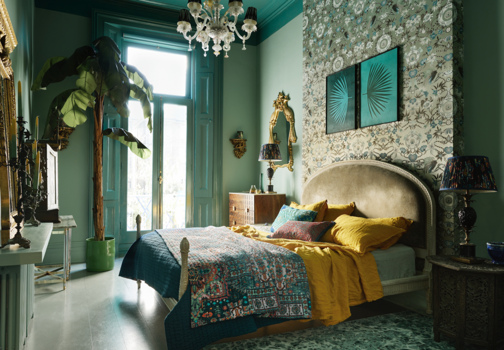
Falling in love with Deià
Matthew discovered Deià by chance roughly eight years ago. He’d been invited to stay in Mallorca by a friend – his first time on the island – took a taxi up to Deià and ‘fell in love with the area straight away.’ Now, by his own estimate, Matthew spends around 50% of his time here.
‘I love the lifestyle and, additionally, I can work here. It’s one of the places where I feel most creative. I’m away from the distractions of the big city,’ he told us.
Matthew’s love of Deià, Mallorca and the Mediterranean has borne fruit in the form of a range of wallpapers and furnishing fabrics, and interior design commissions for the Nama restaurant in the middle of the village as well as the sumptuous and extremely popular Suite 67 at Belmond La Residencia.
Matthew Williamson: a life in colour
In her introduction to Living Bright, British writer and TV presenter Michelle Ogundehin writes that Matthew’s style and singular way of looking at the world epitomize joy.
Growing up in what he calls a ‘kaleidoscope of colour’ was a huge influence on Matthew. He writes that the inspirations for his style are ‘my parents and the women I’ve met over the years, my British sensibility combined with my passion for faraway cultures and craftsmanship, all anchored by bold and beautiful colour.’
While studying at the prestigious Central St Martin’s College of Art and Design, he was taught colour by his flamboyant tutor Natalie Gibson. As part of his degree, he spent a year working in a textile factory in New Delhi, India, a period he describes as ‘at every turn an assault on the senses’.
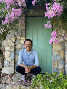
Matthew has visited India over 40 times. He told us the country is ‘my favourite place to travel to for inspiration and artisanal crafts. The culture, people, architecture inspire me. I infuse what I see there into my work.’
Colour has been central to Matthew’s design sensibility ever since he started in fashion, making a splash with his enormously influential 1998 ‘Electric Angels’ collection first of all. When it comes to interiors, ‘colour is in essence the single most exciting and powerful component’ in his approach.
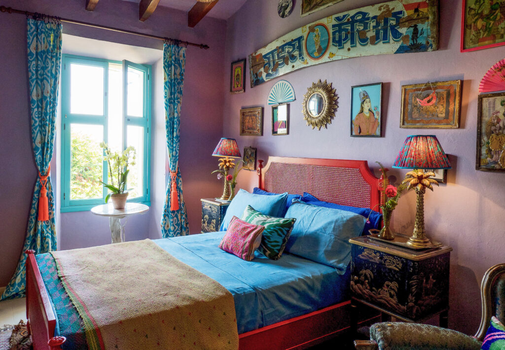
Living Bright: the art of colour
Matthew was approached by publishers Thames and Hudson back in 2020 to create what he describes as ‘a hardworking hand book showcasing all my interior design work centred around colour for those who might be a little tentative to use colour in their homes.’
Describing himself as flattered, Matthew wrote the book without a ghostwriter to make sure it stayed personal. It’s about ‘the art of colour and how I believe it to be the single most powerful, transformative tool to have in your creative kit,’ he says.
In Living Bright, Matthew emphasises that there are no colour rules, dos or don’ts. In fact, it’s about embracing the colours that resonate most strongly with the reader and using these to ‘spark joy in yourself and those around you’.
Moreover, Matthew writes that he gravitates towards colours that ‘create a positive atmosphere and feeling.’
A personal rainbow
Living Bright is divided into an idiosyncratic adaption of the seven colours of the rainbow. Matthew’s daughter Skye inspired this structure.
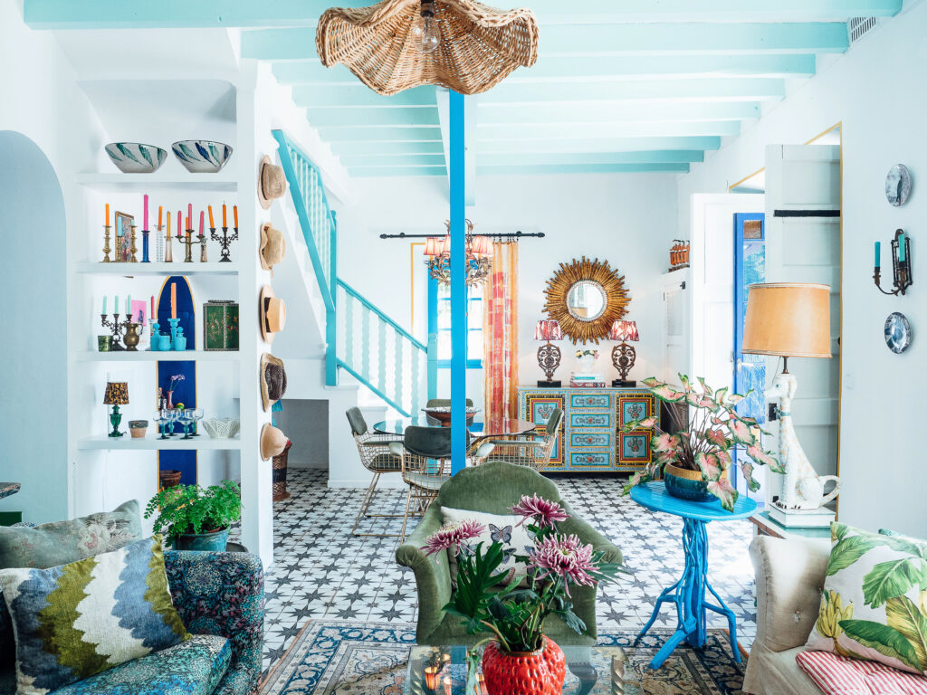
His rainbow includes yellow, of which he writes ‘living as I do mostly in the Mediterranean, yellow is just a shade that feels right’, purple, green, blue, red, orange. Matthew’s favourite colour pink is naturally included.
Matthew’s time in Mallorca has, in addition, influenced his use of pink. ‘I use soft plaster pinks a lot. Instead of neutrals such as, for instance, beige, ivory or white. I contrast them with accents of soft sage green as well. I’m sure this has come from living in Mallorca, and seeing the warm pink tones of the mountains at sunset and the steeped banks of the olive tree leaves, he added.’
Colourful homes
Asked why he thinks so many homes in Mallorca tend to use a soft, neutral palette, Matthew has a theory. He suggests that it’s because they’re ‘largely for holiday makers and also those with second homes who, moreover, may well want a very clean, simple and gentle palette that works well on holiday as well.’
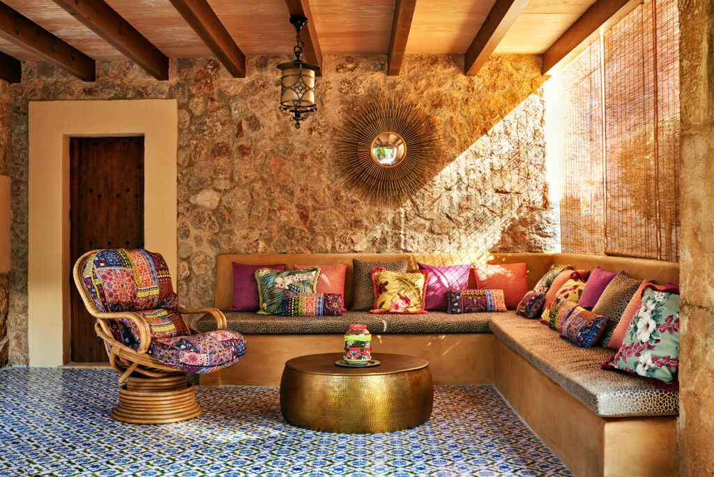
Fortunately for those of us who love colourful homes, Matthew’s own work ‘tends to be somewhat bolder as I use more saturated colours, textures and patterns as I believe these layers tell a more interesting story and are arguably easier and more practical to live in.’
Now that Living Bright is published and getting great reviews, Matthew is very much looking forwards to being back in Mallorca. He’s ‘focusing on renovating my own home, and planning a few homeowner projects. In between these, I’m looking forward to painting again. In addition to my work as a designer, I’m a keen painter. I can’t wait to get my canvases out next and hunker down towards the end of what’s been a busy year.
Living Bright‘s 20 questions: finally finding your design DNA
Matthew’s 20 questions which he always asks a new client are almost worth the price of the book alone. They provide an excellent way for you to decide on a way forwards for your interior. Designing your own interior or, additionally working with a designer. Here they are in full.
- What’s your earliest childhood memory?
- What’s your favourite colour?
- What’s your favourite flower?
- What’s your favourite scent?
- Who are your favourite artists?
- Who are your favourite designers?
- Who or what is your favourite musician or track?
- Your favourite film?
- Your favourite cocktail?
- Your favourite city break?
- Your dream long-haul destination?
- Your favourite hotel?
- Your favourite restaurant and bar?
- Do you have a design hero or icon?
- Do you have a hobby or collect anything?
- What’s your favourite building?
- Do you favour modern or classic design?
- Do you have a favourite decade?
- What’s your most treasured possession?
- What’s your motto?
Living Bright is available now via matthewwilliamson.com. For interior design projects please contact paola@purepr.com


